(Day 90 of 100) Final Project -Part 2
UX/UI Design -Single Page Design Pattern
My First Motivation: Single Page and Continuous User Experience.
When I started tackling the UX/UI design for the first time, one idea that was lurking at the back of my mind was to minimize number of pages to prevent disruptive user experience that may arise from having to look for information by redundantly clicking and navigating through the site back and forth. I mean, wouldn't it be awesome if you can stay at the same page and effortlessly fetch and modify all information as you please?
Encountering Problems
But, as I progressed through the design process, I quickly realized that this single page design pattern/approach was technically challenging and complex to implement as I tried to compact the page with many number of distinct and grouped information. The main challenge was executing CRUD (Create, Read, Update and Delete) on the same page without having to navigate to another page.
For instance, in the Company detail page shown below, I have five distinctly grouped information, which are: General, Accounting, Address, Contacts and Services. The complication on this instance came about from trying to create, read, update and delete item(s) on the same page.

Although still complex, executing CRUD on General and Accounting information on the same page were still tangible with a minimal user disruption. Because the data contained in the General and Accounting were just single layered flat data, the data could be executed with CUD directly on the same page using custom-made intricate select-box mechanisms as illustrated below. But the key challenge here is having to develop these custom select-box mechanisms in the coding phase (or find the library, if lucky), which would be time consuming for the development.

However, the root of the problem came about from attempting to perform CRUD in the multilayered, table data structures presented in Address, Contacts and Services while staying on the same Company detail page. For example, each Contacts item illustrated below had additional information in its second layer such as profile picture, personal websites, etc in the detail view that’s not shown on the table and which you would need to drill down to.

The main difficulty was figuring out how to introduce the mechanism for revealing detail info of the contacts to the main Company info page and the mechanism for creating and updating an item in the table from the same page, while still providing continuous user experience.
My first temptation was to use the modal to trigger a form where I can view, edit or add an item. But that would be disruptive in the user experience as the modal would draw all user’s attention to the modal and away from the main page. The second idea was to have inline form appear and disappear when triggering for view, add or edit function. However, that would make the content feel too messy as contents would move too frequently for users to get accustomed to.
Reverting back to the Traditional Method: Tabs
I was drained out with ideas to introduce a clean way to make the information available and editable in a single page. I acknowledged my defeat and I chose the traditional method of navigating between different information using tabs instead as illustrated below. I ditched the modal approach because user might be annoyed with too many popups, which would break the continuous user experience.

The idea in the above UI is that most of the information can be viewed in the Overview tab so that the users don’t have to navigate to other tabs unless they really need to (ie either to edit the data or to view more detailed info related to the item), thereby, minimizing the breakup in the user experience.
Ditching the Tabs and Stealing a Brilliant Idea from an Existing Website
Then, I remembered that there was a right side slide mechanism to view the detail of an item in the table from Zoho Creator. However, in Zoho, they only used the slide mechanism to view the information. I, on the other hand, decided to use this mechanism to not only view the detail info but also edit and manipulate that info as well so that the user can stay on the same page at all times. The right side slide mechanism is different from a modal because you are still able to navigate and interact with the main page where you are currently at with this mechanism.

As an example shown above. User can view, create, edit and delete Contacts item on a window slide. I believe user experience is better in this example than the tabs because you can always stay at the company info page and edit all its contents without having to navigate to another page.
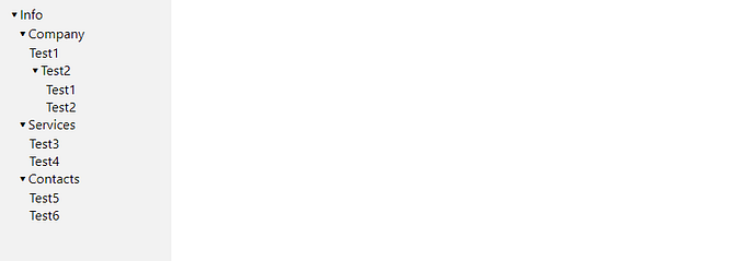
Recapturing Single Page Pattern with a Flow Chart
I just wanted to provide a visual aid that provide a thought process on how to implement Single page design pattern.

Snapshots of the whole application design
I used Adobe Illustrator to design the web application and downloaded some svg artworks such as eye icon, country flag, check marks, etc from flaticon.com, which is free. I had already picked up some basic illustrator skills through few tutorial videos on the net prior to this 100 day challenge. I personally liked Adobe Illustrator over other UX/UI tools that I have tried, which are Figma and Visio. Figma is simple and easy to use but it was overtly simplified and did not have enough control features to design what I wanted exactly. Worse, Visio was just way too cumbersome to design anything. Visio provided templates but the control was terrible for my taste. Once again, this is coming from a person with very little design experience. Anyway, the total time it took me to complete this design process plus writing this article was give or take 3 full working days or about 30 hours in total. See below for the snapshots of the whole application.